Minimalism – have less, be more!
The existing building was designed earlier and performed an industrial function.
In accordance with the task, it was impossible to change the contours of the plan, but it was possible to make changes to the structure of the building and add one floor, part of which was to be used as a terrace.
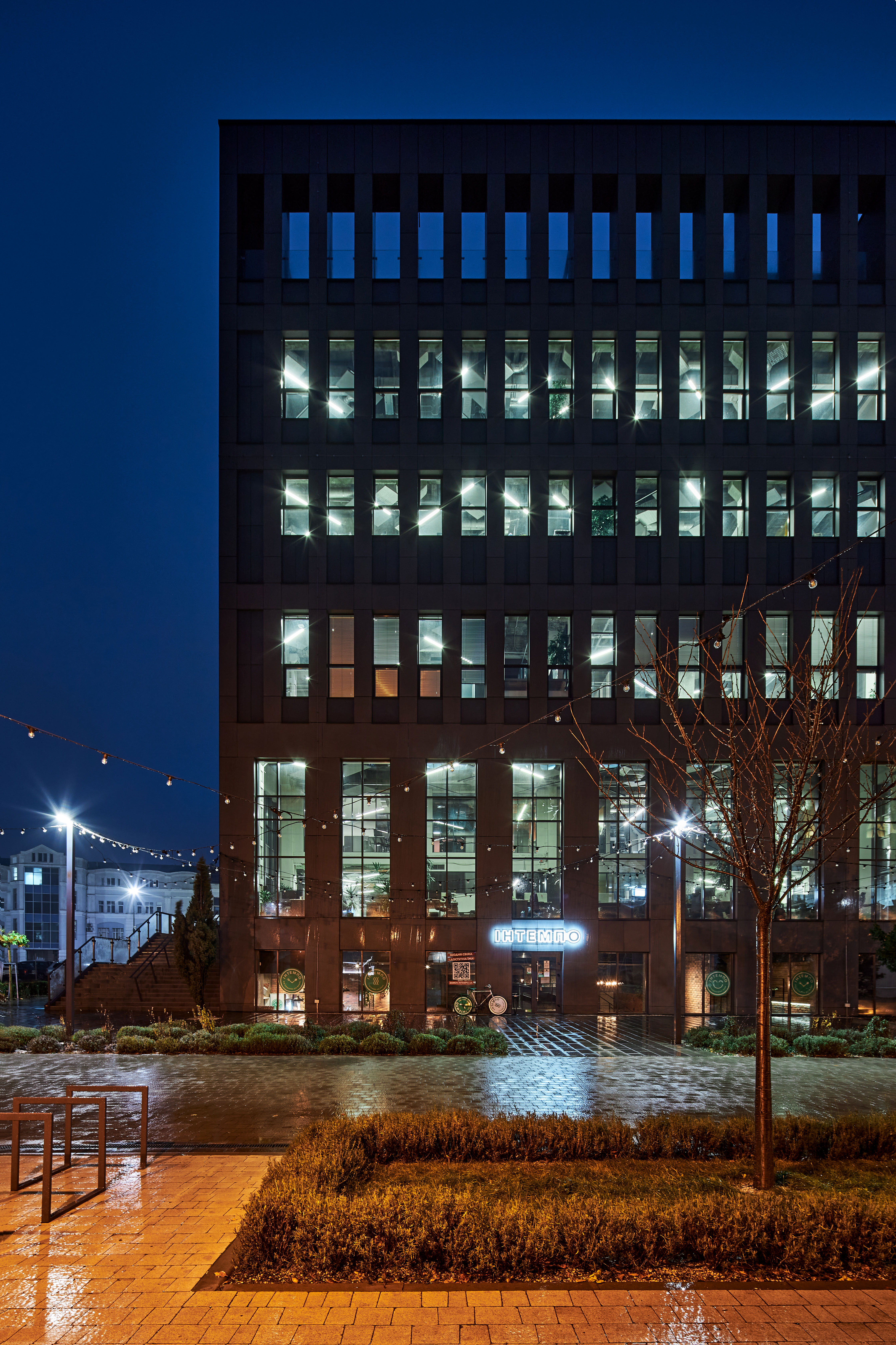
It was necessary to find an organic solution for the facades that best suited the building plans and the latest trends in modern architecture.
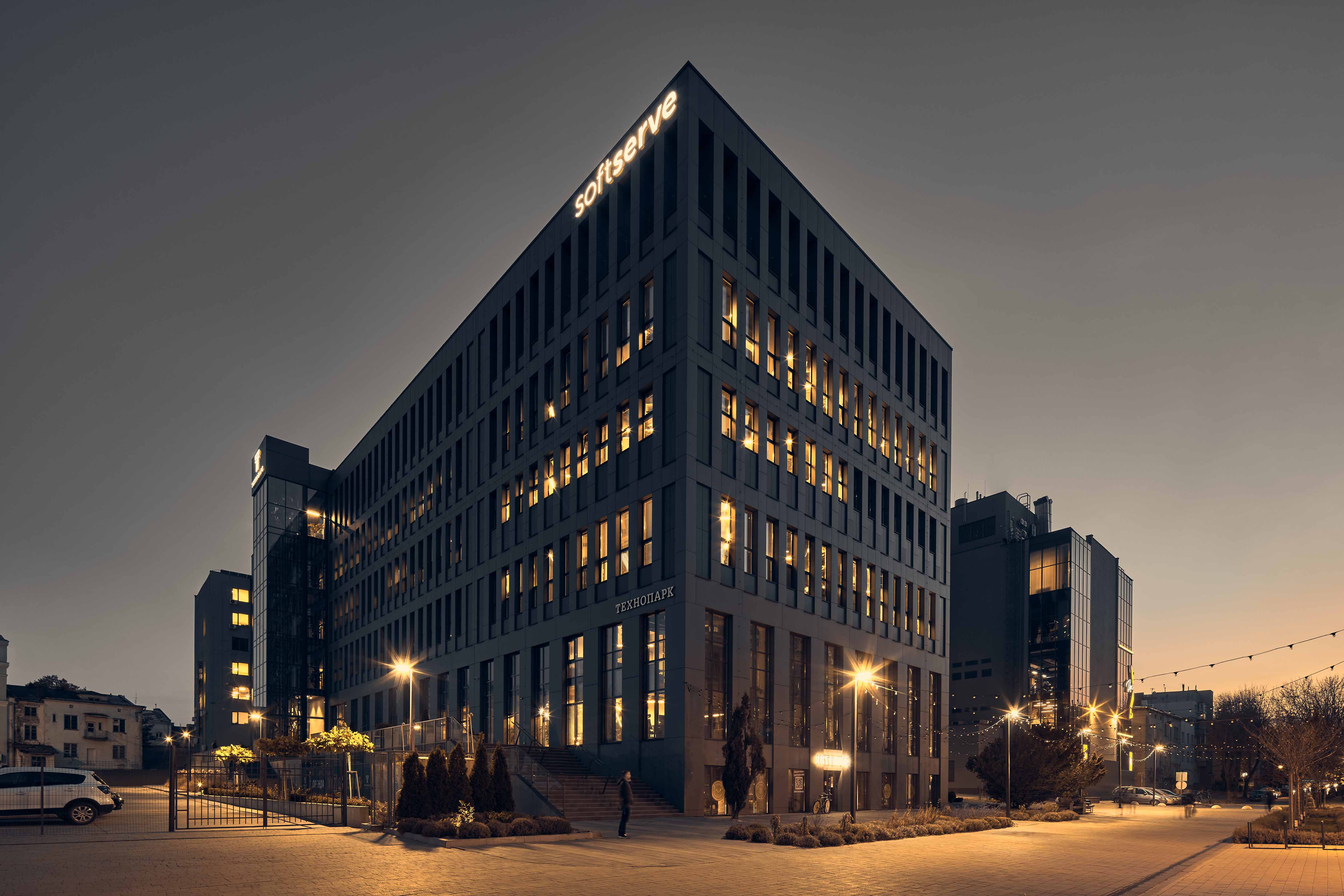
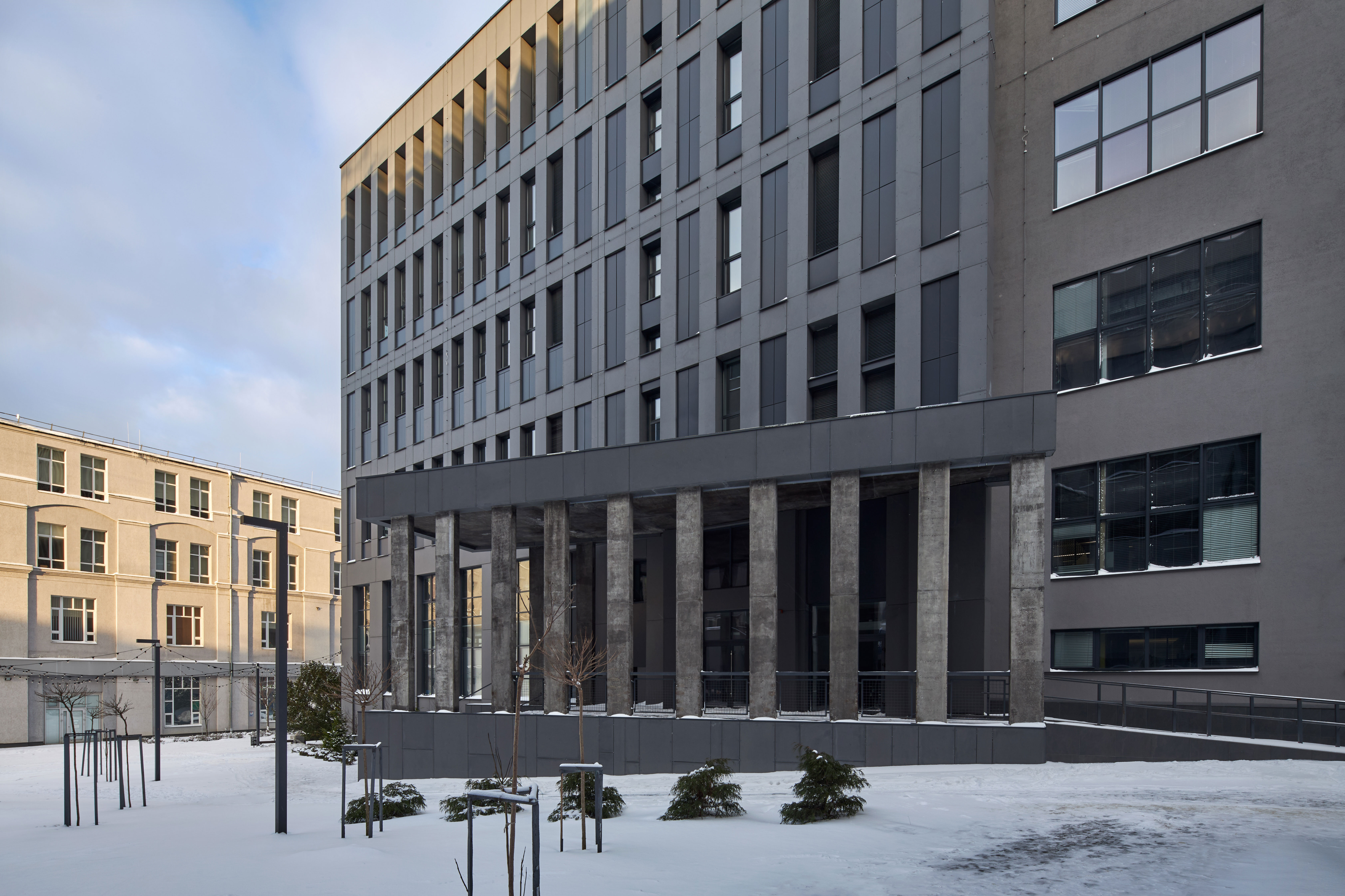
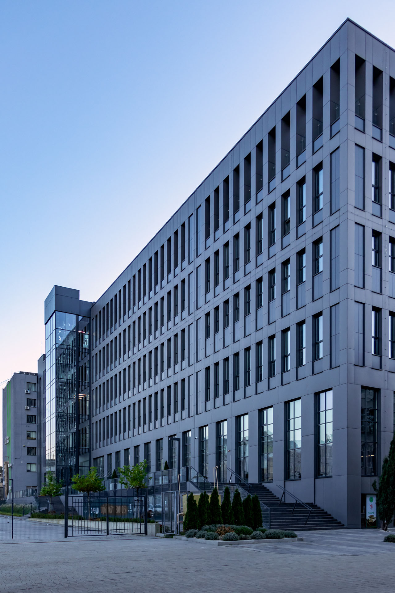
At the concept stage, several options for the facade were found, of which the most minimalist option with a clearly defined rhythm of window placement was chosen. In general, the building consists of a window module and a partition, which defines the parametric structure of the facade. The façade design was developed using a ventilated façade solution and fiber cement as the finishing material. The motif of the facade is a modular rhythm and the depth of the facade is 300 mm.
The main emphasis will be on the panoramic glass elevator, which goes beyond the building and divides it into two parts.
At night, the window niches are illuminated with a certain pitch, which will emphasize the clear structure of the facade.
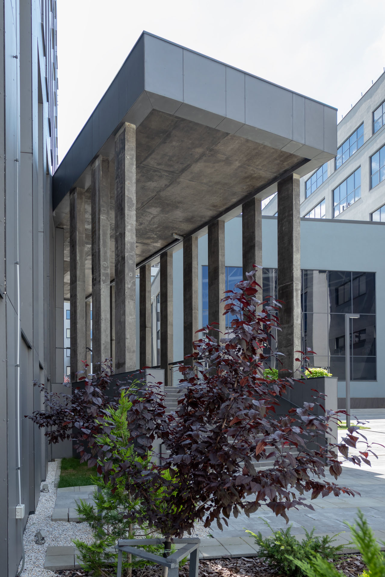
The lower part of the building is a promenade that serves as the main entrance and a terrace for the cafe located on the ground floor.
An adjacent volume is planned to be built in the courtyard, which will serve as an additional entrance.

